01 · Context
Making a small research corpus easier to traverse
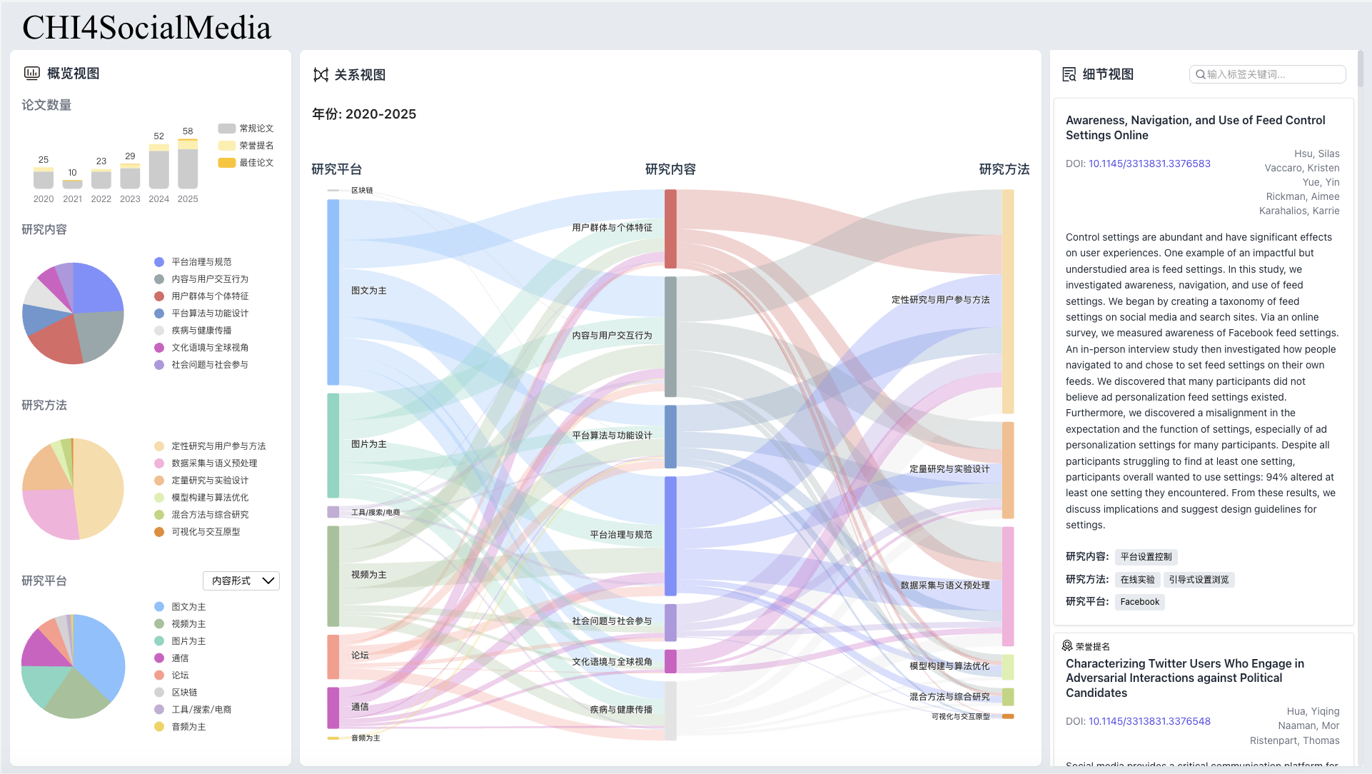
The project organized 197 CHI papers about social media with tags for research content, methods, and platform categories. A single chart could summarize the corpus, but it could not show how those categories related or which papers produced a pattern.
Offered through a course in collaboration with a laboratory, the project selected participants through an online interview. The three-person implementation team built one desktop dashboard with coordinated overview, Sankey, and details regions. The collaboration context is important, but the public claim remains an implementation contribution—not a user study or a new HCI research finding.
02 · Contribution
Overview charts and the handoff into relational exploration
I owned the Overview Panel, including stacked bar charts and pie charts that summarize time, award status, and tag distributions. I also implemented the filtering handoff from those charts to the Sankey view.
- Built the Overview Panel as my assigned module in a three-person frontend team.
- Added selection states so a chart interaction could become a filter rather than an isolated highlight.
- Connected overview selections to the Sankey view while collaborating across separate feature branches.
03 · Interaction flow
From a distribution to the relationships behind it
The key interaction decision was to use overview charts as entry points into the central relationship view. This keeps the overview useful for exploration rather than leaving it as a static summary.
- 1Select
Choose a year, award state, or category in an overview chart.
- 2Translate
Represent that chart selection as filter criteria shared with the Sankey module.
- 3Update
Recompute the visible nodes and link weights for the filtered paper subset.
04 · Outcome & limits
A complete public artifact, with a deliberately limited claim
The team delivered a deployed dashboard and public source repository. For my portfolio, the project demonstrates frontend collaboration, data visualization, and linked-view state handling.
- The corpus contains 197 records and should not be described as a comprehensive CHI literature database.
- Tagging was substantially manual, so the interface inherits the dataset’s coverage and consistency limits.
- No formal usability study was conducted; the project does not establish that the dashboard improves research performance.
- The interface was designed primarily as a desktop research workspace and is now archived.
05 · Artifacts